roc_chart_from_labels_table_chart
At a glance
Useful for: Assessing the relationship between True and False Positive Rates.
API Documentation: roc_chart_from_labels_table_chart()
What is needed to generate the chart? A trained linker and a corresponding labelled dataset.
Worked Example
from splink.duckdb.linker import DuckDBLinker
import splink.duckdb.comparison_library as cl
import splink.duckdb.comparison_template_library as ctl
from splink.duckdb.blocking_rule_library import block_on
from splink.datasets import splink_datasets, splink_dataset_labels
import logging, sys
logging.disable(sys.maxsize)

df = splink_datasets.fake_1000

settings = {
    "link_type": "dedupe_only",
    "blocking_rules_to_generate_predictions": [
        block_on("first_name"),
        block_on("surname"),
    ],
    "comparisons": [
        ctl.name_comparison("first_name"),
        ctl.name_comparison("surname"),
        ctl.date_comparison("dob", cast_strings_to_date=True),
        cl.exact_match("city", term_frequency_adjustments=True),
        ctl.email_comparison("email", include_username_fuzzy_level=False),
    ],
}

linker = DuckDBLinker(df, settings)
linker.estimate_u_using_random_sampling(max_pairs=1e6)

blocking_rule_for_training = block_on(["first_name", "surname"])

linker.estimate_parameters_using_expectation_maximisation(blocking_rule_for_training)

blocking_rule_for_training = block_on("dob")
linker.estimate_parameters_using_expectation_maximisation(blocking_rule_for_training)


df_labels = splink_dataset_labels.fake_1000_labels
labels_table = linker.register_labels_table(df_labels)

linker.roc_chart_from_labels_table(labels_table)
FloatProgress(value=0.0, layout=Layout(width='auto'), style=ProgressStyle(bar_color='black'))
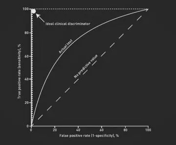
What the chart shows
The chart plots the True Positive Rate against False Positive Rate for clerically reviewed records. Each point on the curve reflects the choice of a match weight threshold for a match and the subsequent True/False Positive Rates.
What the chart tooltip shows
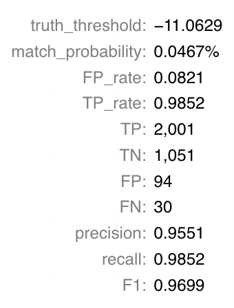
The tooltip shows information based on the point on the curve that the user is hoverng over, including:
- The match weight and match probability threshold
- The False and True Positive Rate
- The count of True Positives, True Negatives, False Positives and False Negatives
- Precision, Recall and F1 score
How to interpret the chart
A ROC chart shows how the number of False Positives and False Negatives varies depending on the match threshold chosen. The match threshold is the match weight chosen as a cutoff for which pairwise comparisons to accept as matches.
For a perfect classifier, we should be able to get 100% of True Positives without gaining any False Positives (see "ideal class descriminator" in the chart below).
On the other hand, for a random classifier we would expect False Positives and False Negatives to be roughly equal (see "no predictive value" in the chart below).
In reality, most models sit somethere between these two extremes.
Actions to take as a result of the chart
If the ROC curve resembles the "No predictive value" example above, your model is not performing very well. In this case, it is worth reassessing your modesl (comparisons, comparison levels, blocking rules etc.) to see if there is a better solution.
It is also worth considering the impact of your labelled data on this chart. For labels, it is important to consider a variety of pairwise comparisons (which includes True/False Positives and True/False Negatives). For example, it you only label pairwise comparisons that are true matches, this chart will not give any insights (as there will be no False Positives).