completeness_chart
At a glance
Useful for: Looking at which columns are populated across datasets.
API Documentation: completeness_chart()
What is needed to generate the chart? A linker with some data.
What the chart shows
The completeness_chart shows the proportion of populated (non-null) values in the columns of multiple datasets.
What the chart tooltip shows
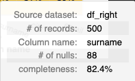
The tooltip shows a number of values based on the panel that the user is hovering over, including:
- The dataset and column name
- The count and percentage of non-null values in the column for the relelvant dataset.
How to interpret the chart
Each panel represents the percentage of non-null values in a given dataset-column combination. The darker the panel, the lower the percentage of non-null values.
Actions to take as a result of the chart
Only choose features that are sufficiently populated across all datasets in a linkage model.
Worked Example
from splink import splink_datasets, DuckDBAPI
from splink.exploratory import completeness_chart

df = splink_datasets.fake_1000

# Split a simple dataset into two, separate datasets which can be linked together.
df_l = df.sample(frac=0.5)
df_r = df.drop(df_l.index)


chart = completeness_chart([df_l, df_r], db_api=DuckDBAPI())
chart