tf_adjustment_chart
At a glance
Useful for: Looking at the impact of Term Frequency Adjustments on Match Weights.
API Documentation: tf_adjustment_chart()
What is needed to generate the chart?: A trained Splink model, including comparisons with term frequency adjustments.
What the chart shows
The tf_adjustment_chart shows the impact of Term Frequency Adjustments on the Match Weight of a comparison. It is made up of two charts for each selected comparison:
- The left chart shows the match weight for two records with a matching
first_nameincluding a term frequency adjustment. The black horizontal line represents the base match weight (i.e. with no term frequency adjustment applied). By default this chart contains the 10 most frequent and 10 least frequent values in a comparison as well as any values assigned in thevals_to_includeparameter. - The right chart shows the distribution of match weights across all of the values of
first_name.
What the tooltip shows
Left chart
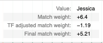
The tooltip shows a number of statistics based on the column value of the point theat the user is hovering over, including:
- The column value
- The base match weight (i.e. with no term frequency adjustment) for a match on the column.
- The term frequency adjustment for the column value.
- The final match weight (i.e. the combined base match weight and term frequency adjustment)
Right chart
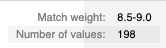
The tooltip shows a number of statistics based on the bar that the user is hovering over, including:
- The final match weight bucket (in steps of 0.5).
- The number of records with a final match weight in the final match weight bucket.
How to interpret the chart
The most common terms (on the left of the first chart) will have a negative term frequency adjustment and the values on the chart and represent the lowest match weight for a match for the selected comparison. Conversely, the least common terms (on the right of the first chart) will have a positive term frequency adjustment and the values on the chart represent the highest match weight for a match for the selected comparison.
Given that the first chart only shows the most and least frequently occuring values, the second chart is provided to show the distribution of final match weights (including term frequency adjustments) across all values in the dataset.
Actions to take as a result of the chart
There are no direct actions that need to be taken as a result of this chart. It is intended to give the user an indication of the size of the impact of Term Frequency Adjustments on comparisons, as seen in the Waterfall Chart.
Worked Example
import splink.comparison_library as cl
from splink import DuckDBAPI, Linker, SettingsCreator, block_on, splink_datasets

df = splink_datasets.fake_1000

settings = SettingsCreator(
    link_type="dedupe_only",
    comparisons=[
        cl.JaroWinklerAtThresholds("first_name", [0.9, 0.7]).configure(
            term_frequency_adjustments=True
        ),
        cl.JaroAtThresholds("surname", [0.9, 0.7]),
        cl.DateOfBirthComparison(
            "dob",
            input_is_string=True,
            datetime_metrics=["year", "month"],
            datetime_thresholds=[1, 1],
        ),
        cl.ExactMatch("city").configure(term_frequency_adjustments=True),
        cl.EmailComparison("email"),
    ],
    blocking_rules_to_generate_predictions=[
        block_on("first_name"),
        block_on("surname"),
    ],
)

linker = Linker(df, settings, DuckDBAPI())
linker.training.estimate_u_using_random_sampling(max_pairs=1e6)

blocking_rule_for_training = block_on("first_name", "surname")
linker.training.estimate_parameters_using_expectation_maximisation(
    blocking_rule_for_training
)

blocking_rule_for_training = block_on("dob")
linker.training.estimate_parameters_using_expectation_maximisation(
    blocking_rule_for_training
)

chart = linker.visualisations.tf_adjustment_chart(
    "first_name", vals_to_include=["Robert", "Grace"]
)
chart