m_u_parameters_chart
At a glance
Useful for: Looking at the m and u values generated by a Splink model.
API Documentation: m_u_parameters_chart()
What is needed to generate the chart? A trained Splink model.
What the chart shows
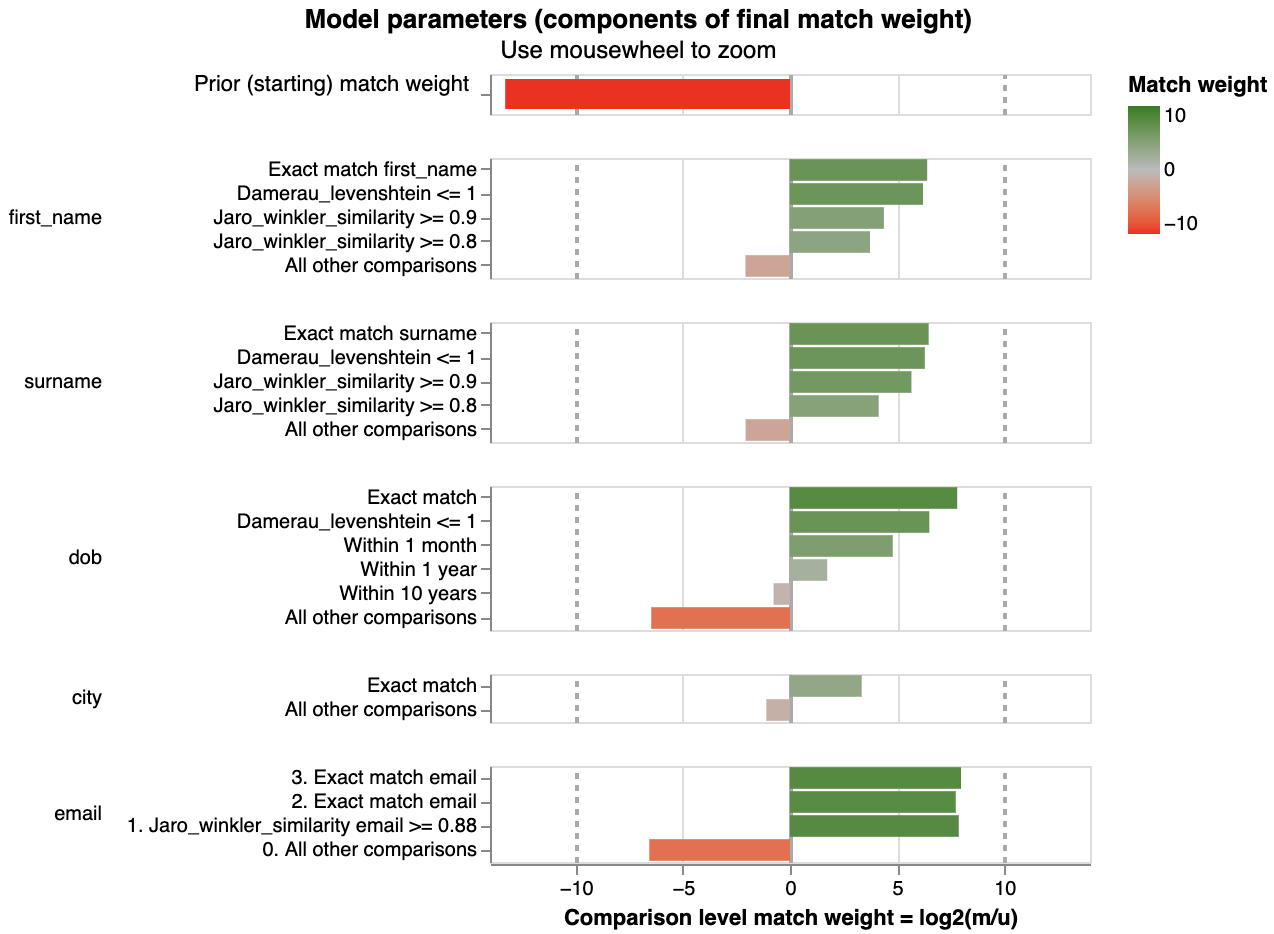
The m_u_parameters_chart shows the results of a trained Splink model:
- The left chart shows the estimated m probabilities from the Splink model
- The right chart shows the estimated u probabilities from the Splink model.
Each comparison within a model is represented in trained m and u values that have been estimated during the Splink model training for each comparison level.
What the chart tooltip shows
Estimated m probability tooltip
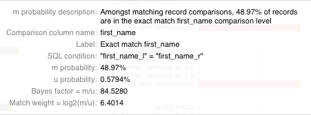
The tooltip of the left chart shows information based on the comparison level bar that the user is hovering over, including:
- An explanation of the m probability for the comparison level.
- The name of the comparison and comparison level.
- The comparison level condition as an SQL statement.
- The m and u proability for the comparison level.
- The resulting bayes factor and match weight for the comparison level.
Estimated u probability tooltip
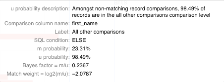
The tooltip of the right chart shows information based on the comparison level bar that the user is hovering over, including:
- An explanation of the u probability from the comparison level.
- The name of the comparison and comparison level.
- The comparison level condition as an SQL statement.
- The m and u proability for the comparison level.
- The resulting bayes factor and match weight for the comparison level.
How to interpret the chart
Each bar of the left chart shows the probability of a given comparison level when two records are a match. This can also be interpreted as the proportion of matching records which are allocated to the comparison level (as stated in the x axis label).
Similarly, each bar of the right chart shows the probability of a given comparison level when two records are not a match. This can also be interpreted as the proportion of non-matching records which are allocated to the comparison level (as stated in the x axis label).
Further Reading
For a more comprehensive introduction to m and u probabilities, check out the Fellegi Sunter model topic guide.
Actions to take as a result of the chart
As with the match_weights_chart, one of the most effective methods to assess a Splink model is to walk through each of the comparison levels of the m_u_parameters_chart and sense check the m and u probabilities that have been allocated by the model.
For example, for all non-matching pairwise comparisons (which form the vast majority of all pairwise comparisons), it makes sense that the exact match and fuzzy levels occur very rarely. Furthermore, dob and city are lower cardinality features (i.e. have fewer possible values) than names so "All other comparisons" is less likely.
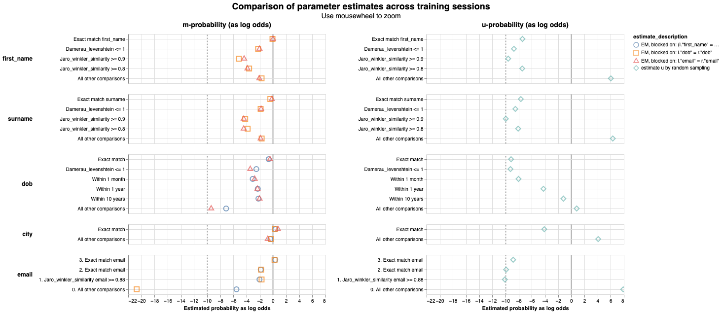
If there are any m or u values that appear unusual, check out the values generated for each training session in the parameter_estimate_comparisons_chart.
Related Charts
Worked Example
import splink.comparison_library as cl

from splink import DuckDBAPI, Linker, SettingsCreator, block_on, splink_datasets

df = splink_datasets.fake_1000

settings = SettingsCreator(
    link_type="dedupe_only",
    comparisons=[
        cl.JaroWinklerAtThresholds("first_name", [0.9, 0.7]),
        cl.JaroAtThresholds("surname", [0.9, 0.7]),
        cl.DateOfBirthComparison(
            "dob",
            input_is_string=True,
            datetime_metrics=["year", "month"],
            datetime_thresholds=[1, 1],
        ),
        cl.ExactMatch("city").configure(term_frequency_adjustments=True),
        cl.EmailComparison("email"),
    ],
    blocking_rules_to_generate_predictions=[
        block_on("first_name"),
        block_on("surname"),
    ],
)

linker = Linker(df, settings, DuckDBAPI())
linker.training.estimate_u_using_random_sampling(max_pairs=1e6)

blocking_rule_for_training = block_on("first_name", "surname")

linker.training.estimate_parameters_using_expectation_maximisation(
    blocking_rule_for_training
)

blocking_rule_for_training = block_on("dob")
linker.training.estimate_parameters_using_expectation_maximisation(
    blocking_rule_for_training
)

chart = linker.visualisations.m_u_parameters_chart()
chart