unlinkables_chart
At a glance
Useful for: Looking at how many records have insufficient information to be linked to themselves.
API Documentation: unlinkables_chart()
What is needed to generate the chart? A trained Splink model
What the chart shows
The unlinkables_chart shows the proportion of records with insufficient information to be matched to themselves at differing match thresholds.
What the chart tooltip shows
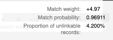
This tooltip shows a number of statistics based on the match weight of the selected point of the line, including:
- The chosen match weight and corresponding match probability.
- The proportion of records of records that cannot be linked to themselves given the chosen match weight threshold for a match.
How to interpret the chart
This chart gives an indication of both data quality and/or model predictiveness within a Splink model. If a high proportion of records are not linkable to themselves at a low match threshold (e.g. 0 match weight/50% probability) we can conclude that either/or:
- the data quality is low enough such that a significant proportion of records are unable to be linked to themselves
- the parameters of the Splink model are such that features have not been assigned enough weight, and therefore will not perform well
This chart also gives an indication of the number of False Negatives (i.e. missed links) at a given threshold, assuming sufficient data quality. For example:
- we know that a record should be linked to itself, so seeing that a match weight \(\approx\) 10 gives 16% of records unable to link to themselves
- exact matches generally provide the strongest matches, therefore, we can expect that any "fuzzy" matches to have lower match scores. As a result, we can deduce that the propoertion of False Negatives will be higher than 16%.
Actions to take as a result of the chart
If the level of unlinkable records is extremely high at low match weight thresholds, you have a poorly performing model. This may be an issue that can be resolved by tweaking the models comparisons, but if the poor performance is primarily down to poor data quality, there is very little that can be done to improve the model.
When interpretted as an indicator of False Negatives, this chart can be used to establish an upper bound for match weight, depending on the propensity for False Negatives in the particular use case.
Worked Example
import splink.comparison_library as cl
from splink import DuckDBAPI, Linker, SettingsCreator, block_on, splink_datasets

db_api = DuckDBAPI()

df = splink_datasets.fake_1000

settings = SettingsCreator(
    link_type="dedupe_only",
    comparisons=[
        cl.JaroWinklerAtThresholds("first_name", [0.9, 0.7]),
        cl.JaroAtThresholds("surname", [0.9, 0.7]),
        cl.DateOfBirthComparison(
            "dob",
            input_is_string=True,
            datetime_metrics=["year", "month"],
            datetime_thresholds=[1, 1],
        ),
        cl.ExactMatch("city").configure(term_frequency_adjustments=True),
        cl.EmailComparison("email"),
    ],
    blocking_rules_to_generate_predictions=[
        block_on("first_name"),
        block_on("surname"),
    ],
)

linker = Linker(df, settings, db_api)
linker.training.estimate_u_using_random_sampling(max_pairs=1e6)

blocking_rule_for_training = block_on("first_name", "surname")

linker.training.estimate_parameters_using_expectation_maximisation(
    blocking_rule_for_training
)

blocking_rule_for_training = block_on("dob")
linker.training.estimate_parameters_using_expectation_maximisation(
    blocking_rule_for_training
)

chart = linker.evaluation.unlinkables_chart()
chart