missingness_chart
At a glance
Useful for: Looking at how many missing values are present in a dataset.
API Documentation: missingness_chart()
What is needed to generate the chart?: A linker with some data.
Worked Example
from splink.datasets import splink_datasets
from splink.duckdb.linker import DuckDBLinker

df = splink_datasets.historical_50k
linker = DuckDBLinker(df)
linker.missingness_chart()
What the chart shows
The missingness_chart show the proportion of missing values in the columns of a dataset.
What the chart tooltip shows
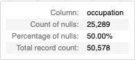
The tooltip shows a number of statistics based on the bar that the user is hovering over, including:
- The column name.
- The count and percentage of null values in the column.
- The total number of rows in the column (including null values).
How to interpret the chart
Each bar of the chart is the percentage of missing values in the columns of the selected dataset.
Actions to take as a result of the chart
In general, columns with high missingness will not have significant impact on the final model results. This is because there will be so many cases where at least one of the records in any pairwise comparison has a missing value that few will actually get scored by the model. If it is a particularly strong identifier (e.g. National Insurance Number, Social Security Number) it can still be worth including a column with high missingness in your model.
In cases with particularly high missingness there is a risk that there will not be sufficient pairwise examples to train the Splink model. In this case, it is generally advised to remove the column from the model comparisons.